This logo design guide will help you understand the often confusing world of print and design. A logo may seem simple—you design one and then use it on your website, business cards, flyers, t-shirts, and everywhere else your brand appears. But in reality, logo design and printing can be more complex than it looks. Over years of creating logos and branding materials, I’ve noticed the same questions come up again and again. This guide answers those common questions in plain, simple language without overwhelming you with technical jargon.
Yes—but with limitations.
Special effects like gradients, fades, shadows, or 3D effects can make a logo look stylish, especially in digital design. However, they often cause problems in professional printing. For example, gradients can look banded or uneven on print materials.
👉 Best practice:
Keep your primary logo simple, clean, and made with solid colors.
If you’d like, create a secondary logo version with effects for online use only.
That way, your logo looks professional in both print and digital formats.
Yes—but not as a flat color.
Gold and silver are not “true” colors in standard printing—they’re metallic effects. To print a logo in metallic gold or silver, you’ll need specialized printing techniques such as foil stamping or metallic inks.
👉 Best practice:
Design your main logo in solid CMYK colors.
If you want a gold or silver version, use it as an alternative and be prepared for special print costs.
Best for: Digital use (websites, blogs, social media, presentations).
Benefits:
Supports transparent backgrounds.
Handles millions of colors.
Does not lose quality when compressed.
Limitations: Not recommended for print.
Best for: Websites, apps, and anything that needs infinite scalability.
Benefits:
A vector format, meaning it stays sharp at any size.
Perfect for logos, icons, and illustrations online.
Best for: Professional printing and editing in software like Adobe Illustrator.
Benefits:
Industry standard for high-quality, scalable graphics.
Used by printers and designers for accuracy and flexibility.
Best for: Sharing and printing logos.
Benefits:
Universally accessible.
Maintains vector quality when saved correctly.
JPEGs are raster images (pixel-based) and lose quality when resized. Logos should ideally be vector graphics so they stay crisp and scalable. JPEGs are fine for quick previews but not recommended as your primary logo format.
PNG logos are versatile for digital branding. You can use them for:
Websites and blogs (including favicons).
Presentations and digital documents.
Social media profiles and cover images.
Online shops and marketplaces.
Adding watermarks to photos or designs.
And because PNGs are widely supported, you can open them on almost any computer, tablet, or mobile device.
Effects in Logos (Gradients, Shadows, 3D)
Gold / Metallic Logos
Logo File Formats and Usage
Why Not JPEG for Logos?
Where PNG Logos Work Well
Vector vs Raster Graphics
Printing Methods: Digital vs Offset
Colour Modes: RGB vs CMYK
Your logo is the foundation of your brand identity, and understanding how it works across digital and print design is essential.
Keep your primary logo simple with solid colors.
Use special effects sparingly and mostly for digital use.
Always request multiple logo file formats from your designer: PNG for digital, SVG/EPS for scalability, and PDF for sharing or print.
By knowing the difference between vector vs raster logos and using the right logo file formats, you’ll ensure your brand always looks sharp, professional, and consistent—wherever it appears.
This logo design guide focuses on helping businesses use the correct logo files for every situation, from websites to professional printing.
As a professional logo designer, I regularly see businesses struggle with blurry prints, incorrect colours, and unusable logo files. That’s why every logo I design includes properly prepared files for print, web, and large-scale use — not just a single PNG.Understanding logo file formats and printing requirements upfront saves time, money, and brand damage later.
Nic Croad - nVision Design
This logo design guide reflects real-world experience preparing logo files that print correctly and scale without loss of quality.
Always maintain a solid-color vector version of your logo as your primary version.
Use effects (gradients, shadows, metallics) selectively—mainly in digital contexts.
Request multiple formats from your designer: SVG, EPS (vector/scalable), PNG (for web), PDF (for sharing/print).
Understand the difference between printing methods and color modes so your logo looks consistent across both digital and physical media.
Below, you’ll find a deep dive into the more technical aspects of designing a logo and what is inolved.
In digital design, we work with two main types of image files: vector graphics and raster graphics. The difference between them is important because it affects how your designs look and perform across different uses—whether that’s a website, a printed brochure, or your company logo.
Let’s break it down in simple terms.
What they are: Built from shapes, lines, and curves defined by math.
Best for: Logos, icons, illustrations, and anything that needs to scale.
Key benefit: You can resize them infinitely (business card → billboard) without losing quality.
File formats: Commonly AI, SVG, EPS, PDF.
What they are: Made of tiny pixels (like a photo made of little colored squares).
Best for: Photographs, detailed images, textures, or anything with lots of shading.
Key limitation: Quality drops if you enlarge them too much—pixels start to show (“blurry” or “grainy”).
File formats: Commonly JPEG, PNG, GIF, TIFF.
 Raster
 Vector
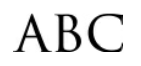
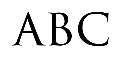
This image shows the difference between a vector and a raster graphic when enlarged. As you can see, the vector stays crisp and sharp, whereas the raster image loses its definition and becomes pixelated.
Use the slider to compare the two.
For a more technical explanation of vector and raster graphics, Adobe provides a clear overview in their official design documentation.
When choosing between digital and offset printing, the best option depends not only on quantity and budget but also on the design elements used in your project.
How it works: Prints directly from a digital file, similar to a high-end office printer, but with professional quality.
Best for: Small to medium runs (e.g., 50–500 copies), fast turnaround, and projects requiring variable data (like personalized names or addresses).
Effects like gradients, glows, and shadows:
Digital presses handle smooth color blends very well, making them ideal for modern designs with subtle gradients or glow effects.
Shadows and transparency effects print cleanly, since the file goes directly to the press without needing to be converted into plates.
Cost: Affordable for short runs, but less economical for very large quantities.
How it works: Uses metal plates and ink that transfer onto a rubber blanket, then onto paper.
Best for: Large runs (usually 1,000+ copies) where consistent, high-quality color is critical.
Effects like gradients, glows, and shadows:
Offset can reproduce these effects beautifully, but setup is more complex. For very subtle gradients or soft shadows, there’s a risk of “banding” (visible steps in the gradient) unless the artwork is prepared carefully.
Offset excels in solid colors and precise color matching (e.g., brand logos with exact Pantone values).
Cost: Higher upfront setup cost, but much cheaper per piece for large volumes.
✅ In short:
If your design includes lots of soft effects (gradients, glows, shadows, transparencies) and you need a smaller run, digital printing is often the best choice.
If you need perfect brand colors, extremely sharp details, and thousands of copies, offset printing is the way to go.
When working with digital graphics and printed materials, one of the most important things to understand is the difference between RGB and CMYK colour modes. Using the right colour format ensures your designs look vibrant on screen and accurate in print. Let’s break it down.
Stands for: Red, Green, Blue
Where it’s used: Digital screens—computers, phones, tablets, and TVs
How it works: RGB colours are created by combining light. The more light you add, the brighter the colours become. For example, combining all three at full strength creates pure white.
Best for: website graphics, social media posts, digital ads, and anything viewed on a screen.
Can display a wider range of vibrant colours than print can reproduce.
Ideal for gradients, glowing effects, and high-contrast visuals.
Perfect for any project that will stay digital.
Stands for: Cyan, Magenta, Yellow, Black (Key)
Where it’s used: Professional printing—brochures, business cards, posters, packaging
How it works: CMYK colours are created by layering ink on paper. Unlike RGB, the more colours you mix, the darker the result becomes. All four inks combined produce a deep black.
Best for: Anything that will be physically printed.
Delivers accurate, consistent colours in print.
Ensures brand colours (like a company logo) are represented reliably across all printed materials.
Works with spot colours and Pantone matching for perfect brand alignment.
If you design a logo, flyer, or ad in RGB but plan to print it, the colours may shift—often looking duller or less vibrant. Printers require CMYK, so files must be converted before production. On the other hand, if you design in CMYK for a digital project, you’ll miss out on the full range of colours available on screens.
To visualise the difference in colour formats;
Slide the slider all the way to the left; this is how the colours will print in CMYK.
Now, slide all the way to the right; this is how the same colours look on screen in RGB.


A great logo isn’t just about how it looks—it’s about how it works across every platform and material. Keep your primary logo simple with solid colors for reliable printing results, and create secondary versions for digital use if you want gradients, metallics, or effects.
Always make sure you have your logo in multiple file formats—SVG or EPS for scalability, PDF for sharing and printing, and PNG for online use. Understanding the difference between vector and raster graphics, and choosing the right color mode (RGB vs CMYK), ensures your brand looks consistent everywhere—from screens to print.
By following this logo design guide and these best practices, you’ll have a logo that’s flexible, professional, and ready for any medium—web, print, or merchandise.
If you’re unsure which logo file formats and printing options you need, I offer professionally packaged logo designs ready for print and digital use — no guesswork, no compromises.
Contact Me